Alright, so I fired up Diablo 3 yesterday, ready to smash some demons. Been playing this for years, right? But honestly, that default UI? Kinda starting to annoy me. The health globe’s huge, the skill icons feel clunky… you know the drill. Figured it was time to mess around and make it work better for me. No fancy promises, just sharing what I actually did.
The Starting Point: Pure Annoyance
First thing, I launched the game. Obvious, yeah? Went straight into Options, looking for the UI stuff. Easy to find, there’s a “Gameplay” tab right there. Skimmed through – lots of toggles for damage numbers, health bars… good basics, but felt like just scratching the surface. Wanted more control. Headed over to the “Interface” tab. That’s where I spotted the key: Advanced Tooltips. Flip that switch on. Boom! Suddenly my skill tooltips showed all the juicy numbers – damage percentages, cooldown reductions – the stuff I actually needed to know instead of vague descriptions. Felt like I wasn’t guessing anymore.
Getting Hands-On With Screen Real Estate
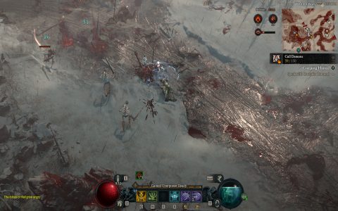
Next mission: shrinking that monster health globe. Seriously, it eats up space. Back in Options, dug deeper this time. Found this gem: UI Scale. Slid that bad boy down a notch. Maybe 85%? Instantly, game screen felt roomier. Skill bar, chat window, minimap – they all shrank down nicely too, looking sharper. Didn’t stop there though. Toggled on Show Item Icons on Ground. Way better than just text names – seeing the little swords or boots pop up saved my neck from bending to read tiny text during frantic fights.
Here’s what else I tried messing with:
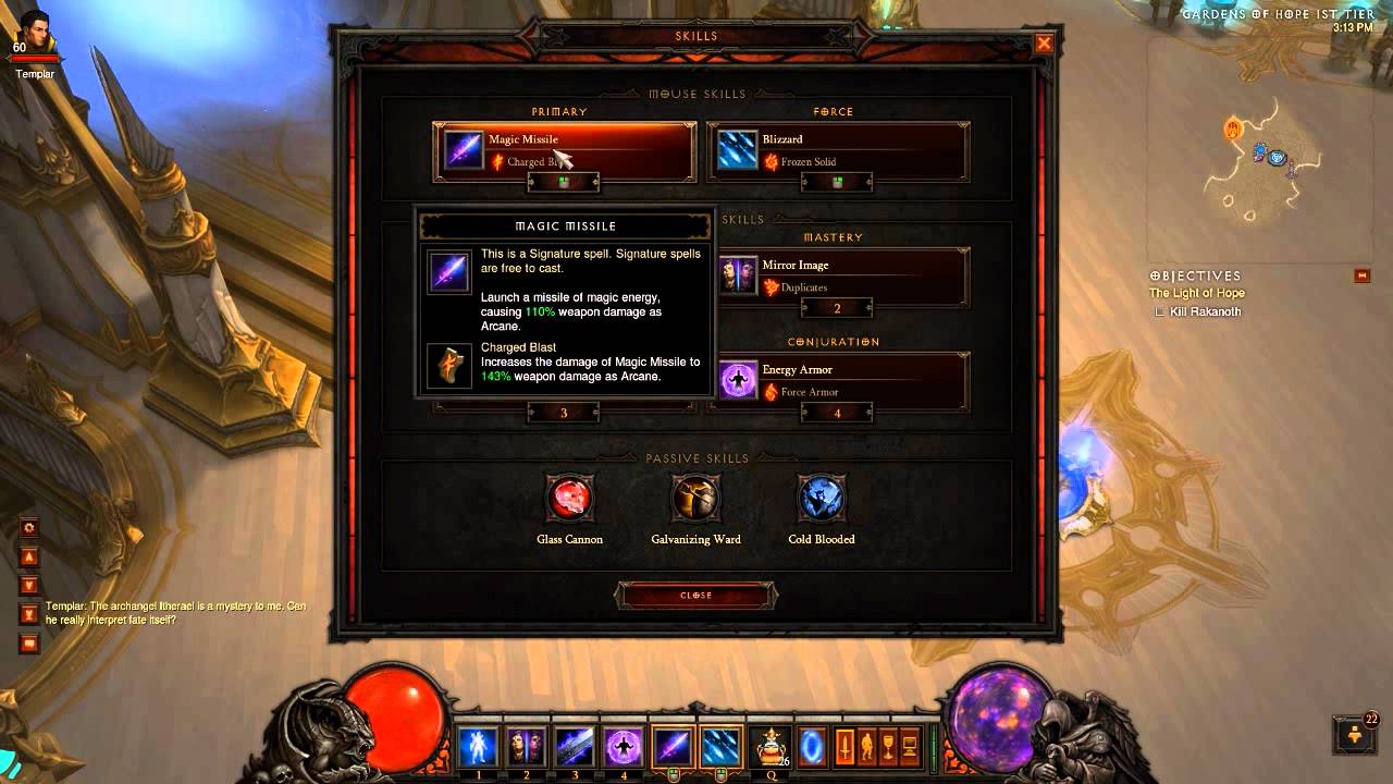
- Elective Mode: Had to enable this. Game changer! Lets you put any skill in any slot. No more feeling forced by the categories.
- Action Bar Paging: Switched it to “Show on Mouseover.” Keeps the secondary bars hidden until I actually need them, cleaning up the view.
- Monster Health Bars: Set them to “Always Show.” Sounds minor, but knowing exactly which elite pack had the big health pool saved my bacon when things got hot.
Encountering Snags (Because Of Course)
It wasn’t all smooth sailing. Tried fiddling with the minimap size separately – couldn’t find it! Turns out it’s tied to that main UI Scale slider. A bit annoying, but manageable. Also messed up the UI Scale once, slid it too low. Suddenly everything looked like dollhouse furniture – icons tiny, text illegible. Slightly panicked for a sec. Undid that real quick. Lesson learned: small adjustments are smarter.
Living With My Changes
Played a full Greater Rift run after making these tweaks. Wow, what a difference it made! Seeing the actual numbers on skills with Advanced Tooltips meant smarter choices mid-combat. The extra screen space from reducing UI Scale felt liberating – less clutter blocking the action. Spotting legendaries instantly because of the ground icons? Yes please. Elective Mode just flowed better with my build.
It wasn’t rocket science, just diving into the menus and trying stuff. Felt like giving my cluttered garage a bit of an organized sweep – suddenly I could find the tools (health bars, skills) without tripping over junk (giant globes, vague tooltips). Game feels snappier, decisions faster, screen cleaner. Simple tricks, maybe obvious to some, but sometimes you just gotta try it yourself. Go poke around those menus!