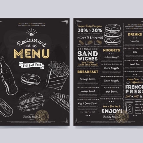
So last weekend I tried designing a stand menu for this little coffee pop-up we ran at the farmer’s market. Let me tell you, it looked like a hot mess at first. I just grabbed some white paper and scribbled the coffee names and prices in different colors. Yeah, huge mistake. People walked right past it. Guess they thought it was my shopping list or something.
Starting Over From Scratch
Okay, so Monday morning I decided to actually figure this out. Tore up that sad first attempt and cleared my kitchen table. Found some thicker card stock in a drawer – leftover from Christmas cards last year. Better than flimsy paper.
First thing? Made the name HUGE. Wrote “MOUNTAIN BEAN COFFEE” right across the top, big black marker. No fancy script, just clear block letters you could see from across the street. Instantly looked more like a menu than my earlier scribble-fest.
Listing Stuff Without Chaos
Next up, actually listing the drinks. My first list was all over the place. This time, I used a ruler. Drew light pencil lines to make three columns:

- Left Column: Just the drink names (“Cappuccino”, “Iced Americano”)
- Middle Column: Simple descriptions (“Hot & Foamy”, “Strong & Chilled”) in slightly smaller writing
- Right Column: Prices (“$4.50”, “$4.00”), bolded so they stand out
Grouped all the hot drinks first, then the cold ones. Suddenly it wasn’t just a jumble of words.
Adding That Little Extra Something
Felt too plain still. Found some stickers from a kid’s craft kit lying around – little coffee cup shapes, stars. Stuck a little red star sticker next to our “Seasonal Special: Maple Latte”. Hey presto! Some visual interest without being messy. Almost missed our “Decaf Available” note – squeezed that into a corner with a little coffee bean doodle near it. Important info needs a little highlight.
The Final Test
Friday night, sat down and wrote out the whole menu slowly with my best penmanship on the card stock. Erased all the pencil lines. Then I actually taped it to a cardboard box in my kitchen and stood across the room.
Could I see “MOUNTAIN BEAN”? Yep.
Could I quickly find the prices? Easily.
Did the special stand out? Red star did the trick.
Good enough!
Took it to the market Saturday morning, clipped it securely to the front of our table. Huge difference! People actually stopped. They glanced at it, pointed, ordered. No more confused squinting. We sold out way faster. Five simple things: strong name, clear columns, simple descriptions, bold prices, tiny visual accents. Turns out you don’t need fancy design skills, just a bit of common sense and a kitchen table.
